Rapid Data Visualization
Evan Davies | May 13, 2020 | 4 MIN READ
Updated: May 2, 2023
In this short post we’re going to look at a new free tool we have released to help people rapidly visualize data to help tell stories or identify patterns. There are many advanced & purpose made graphing software platforms such as Gephi, but they require you to install and can be cumbersome or overkill for smaller data analysis tasks. Also, we are a fan of similar tools such as Connect-the-dots by Databasic but found that it wasn’t robust enough to fulfill deeper pattern & link analysis on-the-fly.
Introducing DataViz by OSINT Combine. It is an automated link diagram tool that creates diagrams. The purpose of this tool is to provide rapid data visualization from local CSV files directly in the browser without the requirement for 3rd party tools & allow you to load concurrent data sets to identify patterns.
You can load CSV files one after the other & it will continuously add to the network diagram with support for up to 4 comma-separated columns, you can rapidly load & visualize data such as Twitter friends lists or domain enumeration data to identify common connections. We have tested out to 10,000 nodes, however, it is possible to load more if your browser can handle it.
All data is processed locally, client-side. No data touches or traverses OSINT Combine servers. The intent is for rapid visualization without having to install 3rd party tools, and also when those tools are restricted from an installation on your operating environment.
Available here: https://osintcombine.tools
Use-cases
We will explore 2 prominent use cases on using the tool and how it can be leveraged to identify patterns with Twitter network analysis & domain enumeration.
Twitter Network Analysis
In this example, we will look at how to analyze the friend’s network of 2 Twitter users to identify any commonality or touchpoints, and how visualization makes that efficient.
Process:
(1) Download the “friends” list of 2 users from Tweetbeaver to CSV (https://tweetbeaver.com/getfriends.php)
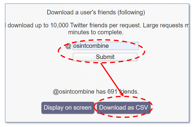
In this example, I downloaded the friend’s lists for @OSINTCombine & @Webbreacher
(2) Load each CSV file one after the other into DataViz (https://osintcombine.tools)
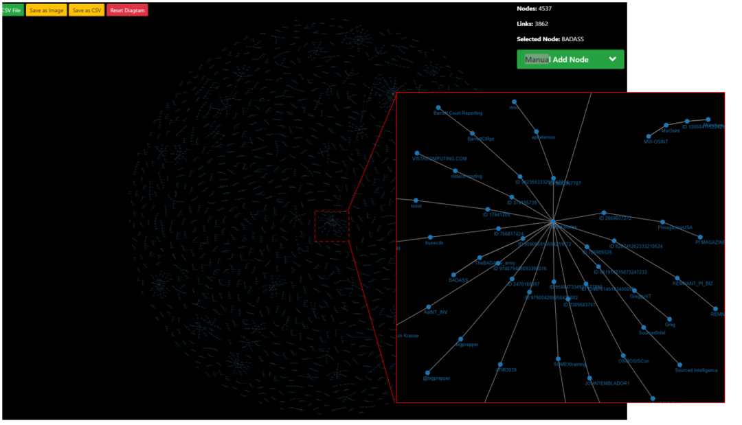
(3) Analysis
The visual representation shows some interesting patterns. We can rapidly see clusters of users associated with common geographical locations based on their profile information. This could be useful when looking at the location clustering of associates across multiple user networks.
What else?
If analyzing a topic or hashtag for a small & set window of time, you could collect Tweets and load them into the tool to see clusters of central nodes. For example, monitoring influencers or disinformation nodes over smaller/set periods of time-related to a hashtag or topic.
Ben Strict wrote an amazing article on doing this at scale (https://twitter.com/BenDoBrown/status/1255547411201691651), however, you could take the same approach and visualize quickly for smaller data sets or shorter time windows without having to use 3rd party install tools & all within the browser.
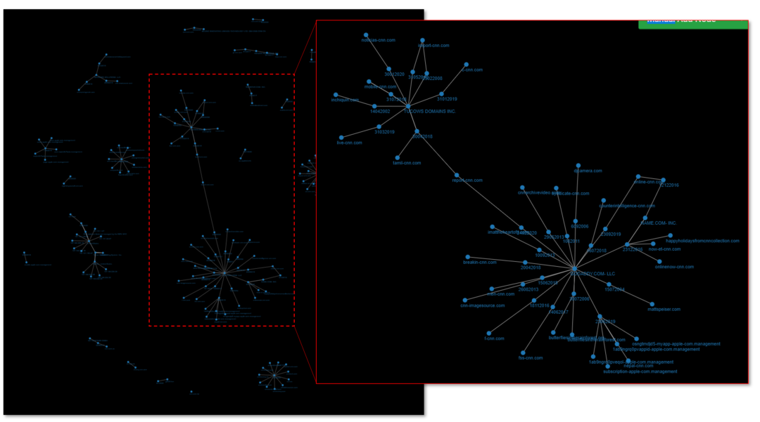
Domain Enumeration
In this example, we will look at conducting domain enumeration to identify any patterns between records & results, rapidly within the browser. Micah Hoffman made a great blog post on how to do this using Maltego (https://osintcurio.us/2020/04/15/data-scraping-and-visualizing-using-instant-data-scraper-viewdns-info-and-maltego/), however, sometimes you can’t install those applications or simply want to do the visualization quickly.
Process:
(1) Conduct a Reverse IP Lookup, Reverse Whois Lookup & IP History lookup at ViewDNS (https://viewdns.info/)
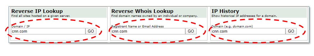
(2) Copy & paste the table results directly into a CSV file. You can make this one long file for a simple & single import
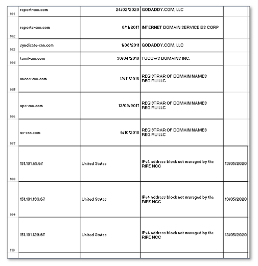
(3) Load this single CSV file into DataViz and analyze any interesting connections such as common registrars, domain registration dates, infrastructure locations or shared IPs.
Conclusion
Visualizing data is an important part of an analyst’s process as it can create efficiencies in identifying patterns in data. This tool is specifically designed for rapid data visualization in the browser, where OSINT people spend a lot of their time, whilst being robust enough to load multiple CSV files & multi-column inputs. If you are doing complex or deep analysis, we recommend using tools such as Gephi as they are purpose-built for large datasets & can tell deeper stories.
We plan to include the ability for JSON imports and direct-text loading in the future. Along with visual icons & automatic coloring of nodes for clusters.